Monday 9 December 2013

A CF Card Dies!

I recently came back home from a full day taking some shots of the Avon Region. I put the CF card into the card reader ready to upload and enjoy the viewing, but my Mac told me it couldn't read it. After reattempting a few times, I didn't waist any time in plugging my camera directly into the Mac to read the images. Once I was happy that my images were safely on my HD I tried to reformat and/or repair this low budget CF card. Ive reformatted this card about eight times but it didn't make the journey to the ninth. Time for a new CF card.

At this time of year everyone is sharing time with family and friends, and taking photos at family gatherings. So some take home lessons for me:

1. Memory cards die as do hard drives.... I keep multiple copies of all of my important images.
2. Don't keep all of your work on a 16Gb card - it's not a long term storage device. Use a number of smaller cards just in case one dies and transfer them after each photo trip or project.
3. Learn how to read images directly from your camera - just in case you need to.
4. Family gatherings are important times of the year, don't keep important images stored on your memory card - copy them to a safer place. 

Here are the images I could have lost. 


have fun! ☺

see more of my images


Subscribe via RSS

Wednesday 4 December 2013

Improving Your Images Step 7: Sharpenning the Image

We are finally here. After adjusting the WB, tweaking the colour space, removing noise and dead pixels, and adding pop and a vignette, we are ready to sharpen the image.

Sharpening is always needed because an image is a digital composition and so lines will rarely be sharp.

There are 1001 ways to sharpen an image. I will show you one that is quick and painless.

step 1: double click on the zoom button to increase zoom to 100%
step 2: with the background layer selected, go to "filters", select the "sharpen" option then locate the "unsharp mask" option.
Step 3: a dialogue box opens, set the amount to around 200, the radius to around 1.5 (but adjust to suit your needs) and the threshold to around 20% (the higher the value the softer the image). Experiment with these setting to see what works for your image.


that is it, we are done. All that is left now is to save the image as a TIFF.


We started with this image:


and finished up with this image:


What  do you think of the result? Id love to hear your thoughts.

have fun! ☺

see more of my images


Subscribe via RSS

Wednesday 27 November 2013

Improving Your Images Step 6: Adding a subtle vignette

Ok, if you have been following me so far well done - we are almost there.
I am now going to show you how to add a professional looking vignette to the image. The rationale behind using a vignette in some scenes is that the human eye is naturally drawn to light colours, so by adding a vignette we will subconsciously draw the viewer's eyes inward - clever hey!?

Here are the steps:
1. Use the oval button to create an oval around the image.
2. Locate the "select" option from the menu bar and scroll down to "transform selection". We use this to center and adjust the shape of the mask. Once happy press enter.
3. Now to select the space between the oval and the border of the image, go back to "select", then scroll down to find "inverse".
4. Now on the right hand panel, click the histogram adjustment layer and slide the black point on the histogram to the right. Immediately you will see the space between the oval and the border darken.
5. Once you are happy with the darkness of the vignette, we need to make it look seamless. We do this by selecting the mask icon inside the histogram adjustment layer we have added. Then locate the slider called "feather" and slide it to the right. The higher the resolution of the image, the more to the right we slide it. Stop when you are happy with the result.


that is it... pretty cool hey!  


Now the last step is to sharpen the image. Sharpening is always done last since it destroys pixels to do achieve sharpness. This will be covered in the next blog.


have fun! ☺

see more of my images


Subscribe via RSS

Wednesday 20 November 2013

Improving Your Images Step 5: Making the Image "pop"!

After 5 weeks of going through steps to clean up an image, we are now ready to get creative. There are many ways to enhance an image depending on your artistic intent. I will go through a quick method I first learned a few years ago.

1. Right click on the background image and make a duplicate.
2. Make sure the background copy is selected, then go to "filter" and find the "blur" option and finally the "gaussian blur".
3. Once selected, a dialogue box will appear, choose a setting (I went with 20 but experiment to see what works best for you). The image is now blurred.
4. Now select the blend mode and scroll down to "soft light".
5. To adjust the blending of these two images (background and the gaussian blurred copy) adjust the opacity until you are happy with the result.
That is it!


 In the next blog we will add a subtle vignette to draw the viewer's attention inward.
 

have fun! ☺

see more of my images


Subscribe via RSS

Wednesday 13 November 2013

Improving Your Images Step 4: Removing dead pixels

In the last blog we removed the noise in an image and opened the resultant raw image into the main Photoshop software. Since the raw image was in 16 bit, we need to make sure we work in 16 bit in the main software. To do this we click on the "image" tab, select "mode" then choose the 16 bit option.


Photoshop CS6 has a very cool feature. It will remove dead pixels quickly and easily without cloning, cutting, pasting and so on.

The steps are best seen.
Select the lasso button, enclose the dead pixel, right click to see options, choose the "fill" option, then click ok. Notice that the default is "content aware".


Hey presto - the dead pixel is removed and replaced with nearby pixels. Now we rinse and repeat to clean up all of the dead pixels. I also circled the boat located in the bottom right corner of the image to remove it. The content aware feature filled in the space beautifully.


In the next blog, we will go through a quick trick to make the image "pop".


have fun! ☺

see more of my images


Subscribe via RSS

Wednesday 6 November 2013

Improving Your Images Step 3: Turning off the noise

Now comes the magic, when shooting in raw we can turn off the noise in an image in about 10 seconds.

Noise is created in an image when a pixel registers a colour that is not present. This will occur when either the ISO setting is high or when we under expose an image and then boost the exposure in post processing.

To turn off the image:
step 1. Click on the third tab on the right hand panel.
step 2. zoom the image to 200%
step 3. adjust the luminance and colour sliders in turn.

remember the point is to remove noise but keep the texture so don't over do it or the image will looked very polished.

step 4. When you are happy with the result we will open the image in Photoshop and then learn how to remove the dead pixels. 


Notice how the noise has disappeared but we still retain texture. The higher the ISO setting the more noise present so the more tweaking we need to do.


In the next blog we will use the main Photoshop software to remove the dead pixels.


have fun! ☺

see more of my images


Subscribe via RSS

Wednesday 30 October 2013

Improving Your Images Step 2: Tweaking the "auto" setting

So far we have set the white colour balance (WB) to render the image close to what it looked like.

Now is the time to see what Photoshop will do if we press "auto".


By pressing "Auto" the software has taken control of the image and done things like
increased the exposure; reduced contrast, and brought out the shadows. Since this is an image taken at sunrise, I don't like the bright sky so I turned the exposure back to 0 (ie original exposure), and increased the colour in the shadows and contrast and clarity. Simply experiment with each in turn, giving slight tweaks as you go. Notice how we have kept the pinks in the clouds - this is due to us not increasing the exposure in the image. 
In the next blog we will look at removing the noise in the image.


have fun! ☺

see more of my images


Subscribe via RSS

Wednesday 23 October 2013

Improving Your Images Step 1: Adjusting the white colour balance (WB)

In the last blog we decided to turn off the camera's control and shoot in raw instead.
If you have used a  piece of software, such as Adobe's Photoshop or Lightroom, you will notice a few things, such as large files and the image looks poor in terms of colour. That is normal, as we will be adding the magic colour ingredient.

We will start by adjusting the white colour balance (WB) of an image. Some reasons why we need to adjust the WB include:

1. When shooting outside, the sun has a different colour (and hence light has a different temperature) at different times of the day ranging from warm orange, to yellow, to cool blue. If you have ever played with your camera and noticed "K" when adjusting colour it stands for "Kelvin" and refers to the temperature of the light. The warmer the light present, the higher the Kelvin we dial in. 
2. When shooting inside artificial light emits a different colour, whether it is fluorescent, incandescent, halogen or a mixture of these and light coming in through a window.

These situations where different colour light is present (green, purple, blue, yellow) affects the colour of those images illuminated, so we simply want to adjust the white balance in the image (ie set what is suppose to be white to white) to ensure the different components look the way they are suppose to. 


It looks easier than it is to read about ... so let us get to it.

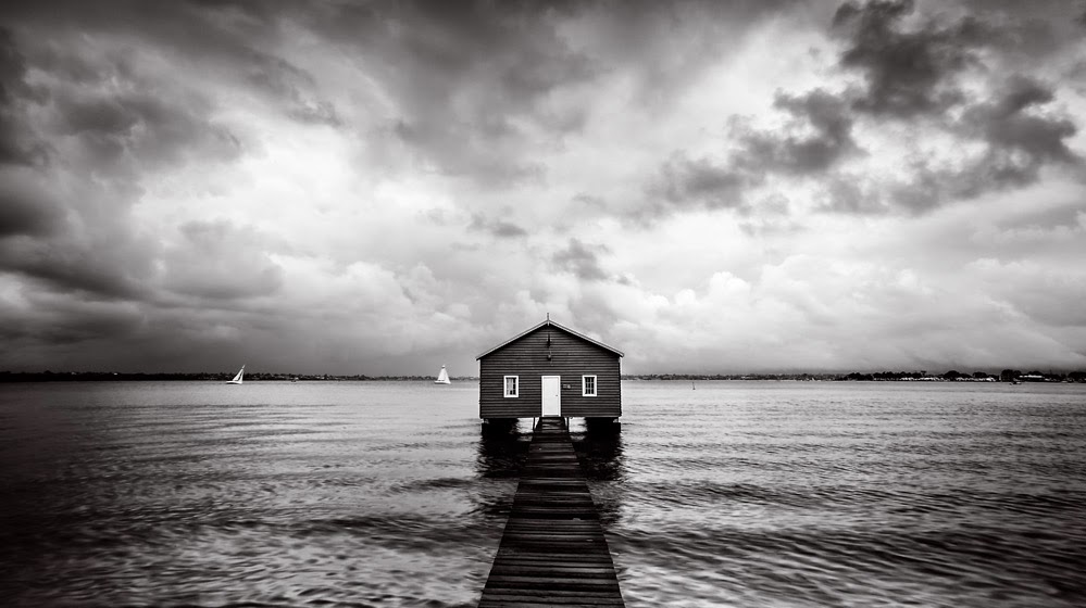
Here is a raw image I will be using to show how to clean up an image. You will see that is has dead pixels, the colour is not very appealing and it is too dark in some places. The first order of business is to set the WB. To do this, open it in photoshop - I use CS6 (from Adobe's creative cloud).

Before we start, we will work in 16-bit/channel (which uses 256 times more data than 8-bit and we need all the information possible to play with images).

To change to 16-bit, click on the link found at the very bottom of the image, the in the depth field, choose 16 bits/channel.


To adjust the WB we click on the 3rd icon at the top menu bar and then choose a point in the scene to set to white. Play around with using different parts of the image and you will see different colour spaces used to colour the image.


Now by selecting different points in the image, a different colour profile is applied to the image. Choose a point that renders the image close to what it looked like. Or if you so choose, alter the colour profile to give the image a cooler or warmer feel.


In the next blog, we will look at tweaking our chosen image to bring out the shadows and a couple of subtle tweaks.


have fun! ☺

see more of my images


Subscribe via RSS

Wednesday 16 October 2013

Post Processing Tip 1: Do you shoot in the raw?

My friends often ask me for advice on how to clean up images they love but didn't turn out as expected. My first question is always "Did you shoot in RAW format?"

So I will spend some time showing and explaining some tips I've learned with photoshop. I am not an expert by any means, but simply enjoy sharing methods I use that help me clean up my images.

Over the next few weeks I will show you how to take an image (taken in raw format) that looks like this:


 and turn it into:


The steps we will take you through will be:
step 1: adjusting and setting the white colour balance.
step 2: tweaking the image
step 3: removing the noise
step 4: removing imperfections and the unwanted boat
step 5: learning a trick to making the image "pop"
step 6: adding a subtle vignette
step 7: sharpening the image. 


So tip number one is: before you take any image - change your camera's setting to shoot in raw format instead of the familiar jpg.

The file size of raw images are lots bigger than that of jpg, and for good reason - it contains lots more information for us to use and we will learn how to enhance these images.

To give a brief overview of raw, jpeg, tiff etc and what we will learn to do, consider the following three general steps back in the days of rolls of film.

step 1. shoot a roll of film and create a negative.
step 2. develop the negative by adding and adjusting colour, tone etc.
step 3. use the fixed negative to print off the image.


Most cameras are generally set to shoot and record as jpg files. These .jpg files take care of steps 1 and 2 above so you can simply print them off and show family and friends. So the camera controls how to represent the colours in the image. 

When shooting in raw format we get images (called digital negatives) that cannot immediately be printed off at your local department store or using your own colour printer. To each image we will apply a colour range (called a colour space or gamut) before saving them into a format that can be  printed off  (eg jpg or my preferred format TIFF).

Sadly there currently is no universal raw format amongst the camera manufacturers. But digital negative format (.dng) is very popular.

The next blog will look at using photoshop to control/adjust the white balance in your raw images.


have fun! ☺

see more of my images


Subscribe via RSS

Wednesday 9 October 2013

Are you happy with your latest image?

Click - now it's time to relax because you have the image you traveled, organised and negotiated with your partner to get permission to go and take. But wait, is it what you want? Is it good enough? If not, would you go back and re shoot it?


Over the past couple of months I have been going to the Crawley Boatshed a few times taking an image in different conditions with different camera settings. I guess I kept going back until I got what I was after. Be open to going back to a location (if possible) and shooting again to get what you were seeking.


Here are my images from three different trips, each having a different feel to it:


have fun! ☺

see more of my images


Subscribe via RSS

Wednesday 2 October 2013

Would you lose your shirt for this?

I've been spending some time at the Crawley Boatshed. The last time was a week ago, the day was overcast with intermittent rain.

I got set up to take some shots, waited for the clouds to be where I wanted them to be, and then it started to rain - I had forgotten to bring a cloth to wipe the filters and my umbrella decided to buckle under the wind and break apart.Thankfully I had a flannelette shirt on, perfect for soaking up rain drops. It was cold, but hey for a good image the shirt came off and the filters were clean enough for long enough to get some shots.

Here is one I liked the most.  I so wanted a third yacht to appear of the other side of the shed, but sadly not on this day.


have fun! ☺

see more of my images


Subscribe via RSS

Tuesday 20 August 2013

What do you think about my current project?

Ok, here is a sneak peek at my current project.

My project is to create a series of images depicting messages that occur every hour of every day all over the globe. Some of the most important messages we ever write will probably be scribbled on napkins, sticky notes, on the back of receipts or in our diary.

Here are a few of my initial concepts and thoughts. 

I guess the first image is perhaps a satirical look at falling in love for the first time. I kept the elements and the message simple. I wanted to portray a strong element of sincerity in the words and feelings felt by the writer - all except the number of names they wrote down. Maybe the person found a place for all that emotion? 


The second image portrays a man who, by the strategies he demonstrates, is a go getter. He is  planning to ask the lady in his life to become his wife. There is a conflict in the image, the man  clearly has experience in setting and achieving goals in a logical manner; however, the scotch glass and water mark on the table top show that he has been at this for a long time - is he getting cold feet or simply finding his emotional path?


The  third image is a cheeky look at daughters and mothers.  From the image it is unclear who will win this battle.


The last image, from the use of colour to the rain falling onto the car window, shows an unwavering decision made with deep emotion but expressed with a cold emotionless tone.


So here are some images of my current project. What the final images will look like, I am not too sure.


If you have any comments or thoughts, I'd love to hear them :-) 


have fun! ☺

see more of my images


Subscribe via RSS

Saturday 10 August 2013

Photographing your holiday

I recently came back from a two week speed trek through France, Belgium and Germany.
What photographic gear would you take with you?

Well I took: 1 camera body, 3x4Gb, 2x8Gb, 2x16 Gb memory cards, a tripod, a light meter, a remote shutter release, my Lee Filters (polarizing and grad ND filters), 6xtwin-battery packs, recharging gear and my 17-40mm, 90mm t/s and my 70-200mm zoom lens.

What lessons did I learn after two weeks?

1. Genuine batteries cost lots more but they last much longer.
2. The zoom lens was next to useless compared to my 90mm t/s and wide angle lens.
3. I lots of thinking fast on my feet to identify a cool scene and how I would compose it. 
4. I took many different types of photos of the same scene to try different techniques and artistic ideas.
5. I didn't have time to use my tripod or seldom used my light meter. But I did get better at adjusting the WB and using the palm of my hand or  the histogram to set the exposure.
6. Using zone focus with crowd shots works well - very unobtrusive.
7. I love my t/s lens - both the tilt, shift and rotation features.
8. I took "just" enough memory cards.

So the next time you head off on a holiday - what gear will you take with you?

have fun! ☺

see more of my images


Subscribe via RSS


Friday 28 June 2013

Understanding dof Part 3:Focus Stacking

So we know about hyperfocal distance. But what happens when we are close to an image?  Here is an image of an old speaker. I wanted to get the top face in focus. My settings were ISO 400 f32 and 1/6 sec exposure with my 90mm lens.


Image taken at f32


No editing was done with this image. As you can see, the image has good depth of field but the back of the speaker is a bit soft. I cannot dial in more aperture and I don't really want to have the decking totally sharp. So what is a solution? Yeap - focus stacking.

Photographers, both landscape and macro, often use focus stacking to enhance the sharpness. The reasons for using this method include:
1. When we stop the aperture all the way down (f32 etc), dof increases but lenses suffer from diffraction causing a loss of sharpness.
2. Poor light but good dof is still needed.
3. Artistic reasons to use the aperture wide open (say f1.2) and play with focus and blur with other elements in a scene.

If you are going to focus stack, then in the field remember:
1. Use tripod to keep the scene fixed.
2. Set your exposure
3. Take several shots from near to far where only the point of focus is changing.

All we are really doing is creating a smaller dof by using say f4 or f8 and overlapping these windows of sharpness to cover the scene in question. Then in post processing (say in Photoshop) we blend them together to create 1 sharp image. 

Going back to the speaker, I used f8 ISO 400 and 1/80 and took a series of images where the front, the middle and the rear of the speaker were respectively in focus. After blending the images, here is the result.


The grill is sharp all the way to the back.

Here is how I used Photoshop (CS6).
1. I shoot in "raw" so I opened each image and saved as a tiff. I used meaningful names like near.tiff, mid1.tiff, mid2.tiff, far.tiff
2. To open all of the images so that each layer in photoshop is one of these images simply: File -> scripts -> load files into stack then find and select your images.
3. Once all of the images are loaded, you will see the image names as a new layer. (giving a decent name to the image makes sense now :-)) highlight each layer. Now we need to align then. Edit -> auto-align layers.   At this point make sure all geometric corrections are deselected.
4.  Once aligned we get Photoshop to blend them to create one sharp image.... Edit -> auto-blend layers choose the "stack images" option and the "seamless tones and colors" option.
5. Sit and wait.

Don't forget to save your image :-)


load the images into a stack

choose files to add

highlight layers before aligning

align layers

make sure to turn off all corrections

after aligning it is time to auto blend

after PS has gone to work we get a blended image

deselect layers to see the composition of the blended image


have fun! ☺

see more of my images


Subscribe via RSS